Appearance Settings
Customize your chat widget's look and feel to match your brand. Configure colors, position, messages, and styling options for a seamless customer experience.
Overview
The Appearance settings let you fully customize how the chat widget looks on your store. All changes are previewed in real-time, so you can see exactly how your chatbot will appear to customers.
All appearance changes are shown instantly in the preview panel on the right side of the settings page. Save your settings to apply them to your live store.
Accessing Appearance Settings
-
Navigate to WooAI Chat
In WordPress admin, go to
WooAI Chatin the left sidebar. -
Click Appearance
Select
Appearancefrom the submenu to open the customization panel. -
Make Changes
Adjust settings in the left panel and watch the preview update in real-time.
-
Save Settings
Click Save Settings to apply your changes to the live widget.
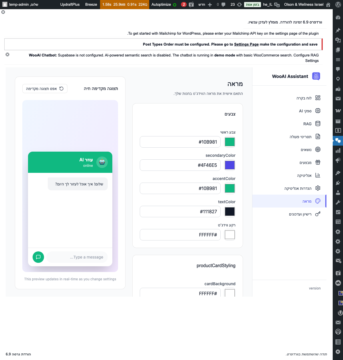
Color Customization
Match your chat widget to your brand colors with these customization options.
Primary Color
The main accent color used throughout the widget. This affects:
- Chat header background
- Send button
- Chat bubble (launcher button)
- User message bubbles
- Links and interactive elements
Popular Color Choices
Additional Color Settings
| Setting | Description | Default |
|---|---|---|
| Header Background | Background color of the chat header | Primary color |
| Header Text | Text and icon color in the header | #FFFFFF |
| User Message Background | Background of messages sent by user | Primary color |
| Bot Message Background | Background of AI responses | #F3F4F6 |
| Widget Background | Main chat window background | #FFFFFF |
Ensure your color choices provide sufficient contrast for readability. Use the preview to verify that text is clearly visible against your chosen background colors.
Widget Position
Choose where the chat widget appears on your website.
Position Offset
Fine-tune the widget's position with offset values:
| Setting | Description | Default |
|---|---|---|
| Horizontal Offset | Distance from the side edge (in pixels) | 20px |
| Vertical Offset | Distance from the bottom edge (in pixels) | 20px |
The widget automatically adjusts on mobile devices to ensure it doesn't block important page content. On smaller screens, offset values are reduced proportionally.
Widget Preview
Here's what your customized chat widget will look like:
Header Settings
Customize the chat header that appears at the top of the widget.
Avatar Options
You can set the chatbot avatar using:
- Custom Image: Upload your own image (recommended: 100x100px PNG with transparency)
- Emoji: Select from available emojis (🤖, 💬, 🛍️, 👋, etc.)
- Icon: Choose from built-in icon set
- Your Logo: Use your store's favicon or logo
Welcome & Placeholder Messages
Configure the default messages your chatbot displays.
Welcome Message Examples
Simple:
"👋 Hi! How can I help you today?"

Friendly:
"Hello! Welcome to [Store Name]. I'm here to help you find the perfect product!"

Informative:
"Hi there! I can help you with:
• Finding products
• Checking order status
• Shipping questions
What would you like to know?"Placeholder Examples
- "Type your message..."
- "Ask me anything..."
- "How can I help you?"
- "Search products or ask a question..."
Typing Indicator Examples
- "Thinking..."
- "[Bot name] is typing..."
- "Finding the best answer..."
- "One moment..."
Launcher Button
Customize the floating button that opens the chat widget.
Launcher Animation
Choose how the launcher button behaves:
- Pulse: Subtle pulsing animation to draw attention
- Bounce: Gentle bounce animation
- Static: No animation
Enable animation only for the first few seconds after page load. Constant animation can be distracting and may annoy customers.
Widget Size
Control the dimensions of the expanded chat window.
| Setting | Description | Default | Range |
|---|---|---|---|
| Width | Width of the chat window | 380px | 300-500px |
| Height | Height of the chat window | 550px | 400-700px |
| Border Radius | Corner roundness | 16px | 0-24px |
Mobile Responsiveness
On mobile devices, the widget automatically:
- Expands to full screen width
- Reduces height to 70% of viewport
- Adds safe area padding for notched devices
- Adjusts input field for virtual keyboard
Behavior Settings
Control how the widget behaves when customers interact with it.
Page Visibility Rules
Control where the widget appears:
Hide on specific pages:
/checkout, /cart, /my-account

Show only on product pages:
/product/*

Hide on admin pages:
/wp-admin/*
Custom CSS
For advanced customization, add your own CSS rules to override default styles.
Adding Custom CSS
-
Open Custom CSS Section
Scroll to the Custom CSS section at the bottom of Appearance settings.
-
Enter CSS Rules
Add your CSS code in the text area. Rules will be applied to the chat widget.
-
Preview Changes
View changes in the live preview panel.
-
Save Settings
Click Save Settings to apply custom styles.
CSS Class Reference
/* Widget container */
.wooai-chat-widget { }

/* Launcher button */
.wooai-chat-launcher { }

/* Chat window */
.wooai-chat-window { }

/* Header */
.wooai-chat-header { }

/* Message area */
.wooai-chat-messages { }

/* Individual messages */
.wooai-message { }
.wooai-message--user { }
.wooai-message--bot { }

/* Input area */
.wooai-chat-input { }
.wooai-chat-input-field { }
.wooai-chat-send-button { }
Custom CSS Examples
/* Make the widget wider */
.wooai-chat-window {
    width: 450px !important;
}

/* Custom font */
.wooai-chat-widget {
    font-family: 'Your Custom Font', sans-serif !important;
}

/* Rounded message bubbles */
.wooai-message {
    border-radius: 20px !important;
}

/* Hide the status indicator */
.wooai-chat-header-status {
    display: none !important;
}Use !important sparingly and only when necessary. Overly aggressive CSS overrides can cause issues with future plugin updates.
Best Practices
Branding
- Match your brand: Use colors from your website's color palette
- Consistent tone: Write messages that match your brand voice
- Professional avatar: Use a clean, recognizable image or emoji
User Experience
- Don't block content: Position the widget where it won't cover important elements
- Clear messaging: Use concise, helpful welcome messages
- Test on mobile: Always verify appearance on different screen sizes
- Avoid auto-open: Consider user preference before forcing the chat open
Accessibility
- Color contrast: Ensure text is readable against backgrounds
- Font size: Keep text at 14px minimum for readability
- Keyboard navigation: Test that the widget is fully keyboard accessible
Troubleshooting
Widget Not Showing
- Check that the widget is enabled in settings
- Verify the current page isn't in the "Hide on Pages" list
- Clear browser cache and reload
- Check for JavaScript errors in browser console
Colors Not Applying
- Ensure settings are saved after making changes
- Clear any caching plugins
- Check if custom CSS is overriding your settings
Position Issues
- Check for conflicting CSS from your theme
- Adjust offset values to avoid overlapping elements
- Test with different themes to isolate the issue
Mobile Display Problems
- Verify "Show on Mobile" is enabled
- Test on actual devices, not just browser resize
- Check for responsive CSS conflicts